Improve an Existing Product
I worked on a project to improve the landing page of Kopernik's website, a non-profit orgnization in a 2-week sprint cycle.
I clarified the website's roadmap related content and tasks, identified by investing mental models and usability, and proposed multiple design alternatives.
After receiveing feed back from the client (Mentor), we went through a last iteration.
Project Information
Project type: Agile development/design (OpenClassrooms Project)
Project year: 2023
Skills: Integrate lean UX into an Agile environment, Create a product roadmap, Define and create an MVP
Role: UX Designer
Goal: Revisiting the information architecture of the web experience, Designing a new website landing page with design and content in mind
Tools; Trello, Jira, Figma whimisical, Optimal Workshop
Part0. Introduction
Kopernik - The Non-profit Organization I worked on
Kopernik reduce poverty by experimenting with potential solutions that address common challenges facing people living in the last mile.
They are working to improve the productivity of women workers, for example, by deploying ergonomic fabric weaving technology.As you can see from the three core types out here,
they are giving solutions that can lead to self-reliance rather than handing out money, food, etc.
Three core type of their work
- Experimentation
Their Solutions Lab team conduct lean experiments of innovative and promising solutions to problems - Technology Distribution
Provide simple, affordable technologies with the people who need them the most has been realized in specific projects & program models. - Last Mile Consulting
Provide PRO advisory services to corporate and public clients who explore innovative products or services designed for emerging markets.
Roadmap
We drew a roadmap of what the future website should be.
The ideal state obtained from usability testing, which will be explained later, was also added.

Project Plan
We worked on this project in 16 days, approximately 2-week sprint cycle.

Part1. Revisiting the information architecture of the website
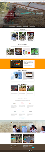
1-1. Existing homepege
my first impression was that it seems clean and well organized with a relatively simple design.
1-2. Current Sitemap
Here is the current site map, with navigation in blue, filters in orange, content in white, and footer in green.
We can see that the information architecture is relatively simple, but there are many duplicate elements in the navigation and footer.

1-3. Methodologies
I conducted Hybrid Card Sorting and Usability Tesitng to test users. They are 3 People who have donated (even outside of the internet) and would like to donate.
Hybrid Card Sorting
The card sorting was done to determine design incosistencies and usability problem areas within the user interface and content areas. It was done by Optimal Workshop.

Usability Testing
We conducted usability testing to access the efficiency of the visual environment of the website's landing page to inform its redesign. we directed them to the task of visiting the site for the first time, learning about the organization and its activities, and donating or signing up for the newsletter.
Tasks:
- See the missions of the organization
- See the work and See the Team
- See current projects
- See media coverage or events
- Overview the partners
- See one of their upcoming projects and Donate
- See one of their upcoming projects and Donate
- See project reports
1-4. Card Sorting and Usability Testing Results
Card Sorting Results
The three groups bordering the red line are the original header & navigation, content, and footer, respectively.
It is hard to tell because of the small sample size, but the card sorting results show that the original placement is relatively acceptable.
Visualization of Participants' Information Architecture
I have put "Insights&REPORTS", which the user perceives as the content inside the project, into the "Projects" pull-down in the navigation and added that content to the body.However, the other content about the project, projects in progress, or projects seeking support, is not put out on the body.The reason for this is beyond me, and I believe a content audit needs to be done and drastically reworked.
Cluster (% of Participants pairing those cards together)
“SIGN IN”
Navigation menu ⇒Footer :66%
“INSIGHTS & REPORTS”
Navigation menu ⇒Contents :66%
No Agreement
Nothing
Findings of Usability Testing
All test users were able to complete the tasks!...But the website has usability problems. And users are not happy with the site.
Positive findings
- All of them were able to successfully complete the task.Good reaction to the UI
- Good reaction to the Navigation menu(It was not a problem if the mental model and navigation differed from the mental model found in the card sorting.)
Negative findings
- The first newsletter sign-up pop-up screen (which feels rude even though the user doesn't trust it yet)
- The footer newsletter signup required users to enter their email address and "submit", and users were concerned that they would complete the registration process without knowing what the content would be.
- Some of the flow and navigation names on the Japanese version of the site are confusing.
1. When viewing team members, pressing the Next Member button returns you to the top page.
2. ABOUT" is "About KOPERNIK" in Japanese, and users do not recall that as the navigation name of the organization or activity.)
3. Unable to return from a page that was navigated from Visit Us
4. The title does not match the description of the carousel image. - Users do not know the difference from other NPOs.(Detailed activities are not communicated to users.)
- Users cannot believe that the project is really taking place.(There are not enough pictures, etc. to show what projects are really underway or have been done in the past)
- Titles of some content are not understood by users (e.g. Case study)
- Some of the icons are difficult to understand. (language, sign in, etc.)
1-5. Proposed updates
Here are 2 IA proposed update. First one is a modest proposal and reflects only what we learned from the card sorting.
Second one reflects the content of the interviews after card sorting and many of the duplicates that can be seen on the site map.
In terms of content, the "Projects" navigation used to include only ongoing projects, but we have renamed INSIGHTS & REPORTS to Past Projects and Ideas, respectively.
We have also created an Upcoming Projects section to provide access to projects that are currently seeking donations.DIGITAI INITIATIVE, which had previously had special content created as part of OUR WORK, has also been moved side by side.
1-6. Key Takeaways & Recommendation
Key Takeaways
- Users do not immediately know from the landing page which project they are seeking support for. May increase drop-off rate.
- Landing pages do not easily convey the organization's track record. Users need to explore different pages in depth (but users are not willing to explore deep into the page).
- Users seemed to feel that some of the content was not clear in its intent. Each piece of content needs to be reviewed from naming to reason for posting.
- Landing page content is often duplicative.
Recommendation
- Declutter the landing page using discovered cluster and editing the UX writing
- Redesign Donation contents with CTA on landing page In the activity description content, add specific case names, not just abstract activity descriptions.
- Display easily visible content such as history, number of projects conducted per year, number of partners, amount of donations, etc.
- In the long term, an overhaul of the Information Architecture based on more extensive research.
- In the long term, redesign the search bar to make it more visible and actionable( when the upcoming projects are many
Part2. Designing a new website landing page with design and content in mind
2-1. Metrics to be captured (Using Google's HEART framework)
This is an metrics that we usually want to capture in improbing the UX of this website.
2-2. Objective and Key Results of this project
This is about the direction of MVP creation.We try to tackle three of them here.
- New Contents, button replacement and UX copy of “Donation” CTA will increase by 5% or more
- Newsletter sign-ups will increase by 5% or more due to the new copy.
- Increase session time /user by 5% by integrating the organization's performance into the landing page in an easy-to-read format
2-3. Propositions
Proposition 1
The first is a traditional suggestion.There are four changes.The design was based on card sorting and usability testing.
- Declutter the landing page (navigation and footer) using discovered cluster and change icons of the login and language
- Display easily visible content such as history, number of projects, number of partners, amount of donations, etc.
- Add Donation contents with CTA on landing page (Individual Project)
- Organize duplicate content areas according to mental models
Findings
- There is a lack of order in the placement of the content within the content.The organization's introduction video and digital initiatives are considered part of "OUR WORK,
- Scrolls a lot.
Proposition 2
This is a design with many changes. There are three additions to design 1.
- In “OUR WORK”section, add self-introduction and work descriptions and integrate stand-alone content
- Newsletter with a New copy
“The latest from Kopernik, right in your inbox”
→ “Subscribe to our newsletter to receive updates and project reports you support” - Add a Donation banner with CTA that can be closed on landing page (To organization)
Findings
- The self-introduction and OUR WORK descriptions make it unnecessary to check the page in depth and reduce the load on new users.
- Should I match the content grid?
2-4. Results of Presentation(Statement and feedback from client)
We presented the two propositions to the client (My mentor) and recieved the following advice.
Feedback
“You need to use the findings from your first design and second one to fix one of the designs so you have one final design was after every study must have you know a revised version”
Specific Revision Request
This bar should show in grayscale because when you show a percentage and you represent visually you have to show what the complete finish is supposed to be like,
2-5. One Last Iteration
As a last iteration, here are the changes from the second proposition.
- Layout changed to fit self-introduction grid
- Change red donation status bar to grayscale.
2-5. A/B test
Here is a comparison of Designs 1 , 2 and last iteration.
The Before landing page looks simple, but there were a lot of usability issues.I think the final design is the one that meets the usability issues and OKRs.We need to continue tracking results and usability testing to evaluate it.
2-6. Conclusion
Conclusion
- The information architecture of the landing page was revised to provide a clearer layout and design.
- Combined with content soliciting donations from users and its CTA, the new homepage design met the nonprofit's main goals and improved the user experience.
Lessons Learned
- After evaluating and digging into the website's information architecture, we discovered that there were issues such as users not knowing why this content was here, and some duplication.
- This new design does not completely solve the problems identified in the research. It is important to turn the iterative approach around quickly.
- It was found that copy and design, including the visualization of information and the benefits of action, are important not only for the CTA button but also for getting users to take action.
Next steps
- Measure the Effectiveness of Redesign
- Conduct Usability Testing
- Conduct Content Audit to understand the meaning of each pages
- Conduct Card Sorting to overhaul the contents of each pages.(Open Card Sorting)


.png)


